Monday, January 16, 2012

Train Tracks

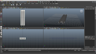
So theses are the stages of how I modelled the train tracks. As I said in the previous post I need to work on them a bit more as they do not fit the train quite right when it moves. Because the train is a solid object and there are no joints in between it, the tracks themselves need to be wider to accomodate the train.


I have had to create the joiner piece of the track separately in order for them to match up to each other perfectly. With this, I can them import it into any other scene file and carry on modelling from there. I find importing a really useful thing, it allows me to check my models against others to see if I'm on the right tracks. Another thing I have found to do is create layers, just like in Photoshop you are then able to make specific things visible or have them turned off. This allows you to concentrate on one particular area without having too much on screen.


So far I've had a lot of problems, not necessarily with the actual model itself but more of the fact that the train can't line up on the tracks properly without cutting into them. The above image (top track) shows how much wider the it needs to be when going round a corner. The original tracks look more attractive and are more like the real thing, however it is just not practical, unless of course I had a massive curve but then I think it will be too big. If I decide to have a curve I will need to go back and re-model the other tracks - it shouldn't take too long now that I know what I'm doing.

Test Animations

Having modelled most of my train I decided to test out some animations. I need to be able to show some of the principles of animation, the ones I had in mind were: squash and stretch, easing in and out, and anticipation.

The image below shows what I plan to animate. The squash and stretch will be used to animate specific parts of my train to give it more substance and life. To go about this I will try using the squash deformer and set key frames in the appropriate places.


The video above just shows a quick test I did using the deformer. It works okay, but I will have to see how it looks when it moves along the tracks as it may or may not work as well. I also modelled some of the tracks in which my train will travel along. I drew them out by hand and used image planes to model them from. I thought it would turn out well and the final models looked really good, however when it came to putting my train onto the tracks and have it travel along it didn't work very well.

I found that some of the curved tracks I created we're too sharp and this resulted in the train cutting into the track. I managed to get it to work on a 'wavy' track as seen below. For this I set up a motion path for it to follow. This is a much quicker way than animating it by hand, however the downside to this is that you don't have the same control over it. I think I will have to experiment with it more to see what happens.


The plan now is to sort out the whole track and come up with an overhead plan so I can then model the final thing. I will also need to model the cacti and the canyon before my environment is complete. Another thing I will have to look in to is texturing, whether I will paint them in Photoshop or find some free textures.

Sunday, January 15, 2012

Guest Speaker - Andy Peers

For this weeks lecture we had a visiting speaker, Andy Peers who worked for Love Enterprise. He spoke about how it was important to have your own values and to let those values guide you in your work. At this stage in life you don't really have a clear set of values that you work by, without recognising it you will never know. Andy got us to write down a few values we thought we would work by and it turns out that the first ones that came to my mind were, honesty, dedication and loyalty. To be honest values may be all well and good, however I found it hard to really get my head around some of the questions he asked us. It was almost like he was putting us in a future setting and wanted us to decide right away within 30 seconds with what we would do say 'if we could change one thing about the world and how would be go about it within our specific field of study'.

What grabbed my interest more was the fact that he went on to talk about how important it is to recognise your own potential, but yet again to know your limitations. By knowing this you are able to push yourself to your full potential, without straining yourself too far and getting stressed with not being able to achieve something. Everything takes dedication and commitment, if you're going to do something, do it really well. I found this as almost a motivational push, to try even harder on my course. Growing up I have always been told to do the best I can and never give up and hopefully one day that will pull off.

Another thing Andy mentioned was about networking, you need to grab the person's attention, you need a statement to draw people in. That got me thinking a lot about if I ever go to a networking event, what would I say? When I went to BAF and met the Pixar animator Andy Schmidt, I got really nervous trying to ask him the simplest question. I definitely need to build up my courage when it comes to talking to people within the industry, I just never know what to say when starting a conversation. I guess I just have to bear in mind that they are all just ordinary people like myself and they may have once been in a similar position to me.

I have found this lecture quite helpful, maybe not exactly in the way of values, but more in the sense that I need to really push myself. I think I also will try and start emailing some animators and see if they have any advice or tips for a student like myself; and try and contact some of the people I met at ThoughtBubble in Leeds as some were doing quite interesting work.

Evaluations

Evaluations - we all know what they are and we all have written quite a few up to this point. At first sight of this lecture I was slightly confused as to how this would help me in any way as I have written quite a few evaluations throughout school and college and never really had any problems with them. However amongst the things that I already knew, there were a few points that were new to me and I had not really thought about before.

When writing and evaluation you should try and not use these phrases:
  • I think I made good progress...
  • Pleased with my work...
  • I worked hard...
As I think back to all my previous evaluations, more times than one I have realised I've used these phrases. They may have been suitable at the time, however at degree level, the wording and the context of those phrases seem quite basic and not adequate enough for what you're wanting to evaluate.

Another way of evaluating is measuring yourself against the best, against professionals. This may seem a bit ambitious, however no-one is expecting you to be exactly like them. I think for me it would be more about the process and comparing the outcome to theirs using the same technique.


Trieste

This is another example of how music and films work together in harmony. For this film, each shot is in synchronization with the music and its beats. By the looks of things I think the shots would have been edited to fit the music. Sometimes its the other way round, but in this instance I think it works really well, it gives the film a beat and a rhythm to go by. Again it shows you need a relevant and coherent piece of music that will work with the film.

For me I quite enjoy the contrast between the fast beat music and the long shots, it gives you time to process things. If it were to have quick cuts through the whole film it would be too much, you would not be able to take all the information in.

I have been looking for some pieces, mainly on Soundtrack Pro at the minute. I have come across a couple which could work, they have a delicate and calm feel to them, however I cannot really do anything yet until we get the storyboard properly sorted out so we know what each shot will be like. I can get an idea at this stage of what to look for, but apart from that it's hard to do much else.


Trieste from Andrija Kovač on Vimeo.

Memory Tree

So after looking at some inspiration for our next film, I thought I would check out something that is contrastingly different to the ones I've already seen. I came across the video below and there are major differences to the ones I have already comes across.

It's quite interesting to see what makes things different from one another. With this video even with a similar subject with the scenery and the model, the way it has been edited and the music on top of it drastically changes the mood of the whole piece. With the short clips and the sudden cuts between them, it gives the piece a powerful feel to it, this is also emphasised by the music and the colour grading of each shot. The timing of the music is essential as each beat is met with a cut to the next shot - we will have to bear this in mind when it comes to adding music to each of our films. Without the right track it can completely throw the whole meaning and feel of the film off.

Even though it doesn't give off a calm and tranquil atmosphere, the shots themselves are still really attractive. They have been composed really well and put together in a way that makes them work consecutively.


memory tree: Canon 5D, 50mm 1.2 from Mike Kobal on Vimeo.

Saturday, January 14, 2012

Carrot or Corriander - Research / Inspiration


But We Emerge from Scott Foley on Vimeo.

This is a really lovely video I found on Vimeo, like the other. Again this has some really well considered shots with colour correction added in post production. What's different about this one is that instead of just music over the top, there is also a voice over. This could be a possibility for us, by reciting the poem over the top when its done. However the only problem with this is that as we want the film to be really tranquil and calm, the poem I don't think will come across as that, the wording of it wouldn't fit quite right I don't think. So if we wanted to do this we would have to pick out certain lines and try and see if it works. If it doesn't it's not the end of the world, we would just have some corresponding music with it.

The shots themselves are quite simple not much movement with the camera, most are actually just stationary. It would make life a lot easier as when editing the first film, Tom found that there was a lot of camera movement when following the actress and it didn't work as we planned. The way around that problem would be to either use a glide cam or to have stationary shots.

2nd Poem - Carrot or Corriander

As our first film is in its editing stage, me and Lija have decided to crack on with the second poem, trying to come up with some basic ideas and find some inspiration to relate to it. The poem that we have chosen is by Ayesha Hussain.

'carrot or corriander me love, with a buttered bun?'
on the cushioned grass we lay once,
the damp patch wet my bum; I watched as he
lay down a soft white linen sheet
his mouth curled into an 'O' as he spoke
and the moment felt wry, as if the damp
clogged up my throat, yet
he spoke silkily, softly
so solemn despite the cool wet wind

The initial ideas we thought about were a possible montage of serene shots as the poem itself comes across as quite calm and peaceful. You get the idea that the people in the poem do not have a care in the world about their surroundings, only to each other. Something that seems quite similar to this is the Heinz Soup Advert. There image below suggests that even though it is really cold and a miserable day, the man is not bothered by any of it because of his soup and its warmth it brings.


The video below is something I found on Vimeo with just searching 'field'. I really love the cinematography in this and this may be a route in which we pursue during our next film. Lija has produced a blog about another video by Camille Marotte HERE. The music for this piece is really stunning. I've come to realise that without music films, games or animations would not hold up well enough. The music can add more emotion to a piece than what is already viewable on screen. When done right it can open up so many doors. As our next film will have a calm feel to it, we will need to find an appropriate track to fit it well. The music we choose needs to emphasise the tranquility of the film.


.:Coquelicot from Camille Marotte on Vimeo.

Friday, January 13, 2012

Sound Recording

Today we decided to record our sound for our first film. We had a quick induction to show us how to set up and export our files once recorded. Lija helped me out seeing as I was doing the voice over. We wanted a strong voice but without it being too overpowering so I thought I would give it a go and see how it would turn out. The voice over will be in the second half of the film dictating certain lines of the poem. We did a couple of takes of each line to make sure we had enough sound to work with and this would enable us to edit it further if needs be. When it comes to the film the sound will also be alongside some other sounds/music so hopefully it won't sound too out of place.


Thursday, January 12, 2012

Little and Large - Storyboard

So for my animation module I have to create a 30-45 second animation based on the title 'Little and Large'. I finally got round to drawing up my storyboard to show what will take place during my animation. At the moment it is still rough and I'm planning to go over each shot in colour to give a better sense of what the scene will actually entail.

Basically what is happening is that there is a train, going along its tracks happy as can be, however it comes to a sudden halt when it reaches almost a dead end with the track being broken to reveal a canyon. It backs up the track frightened and not knowing what to do, however it builds up the courage to try and go for it and shoots down the track and over the canyon. To show that it's little and large, on one shot the camera will zoom out to show how small the train is in comparison to the large gap of the canyon.


I have tried to keep everything simple at this stage, not only for my benefit but more for the fact that because of the style of the train, a simple environment is more suited for it. When you look up Brio, everything is all child friendly and is created using simple shapes and colours. I have set my train in the desert because of the canyon. As there are no Brio cacti to reference from, I looked at Brio trees to get the basic idea and went from there.


As I have mentioned above on the design sheet, I will need to experiment with how I want my cacti to look. Will I want them to be textured like a real cactus? or will I just want to keep with the basic colours. If I were to texture it properly, I run the risk of it being too life like and not fitting in well with the train, however I think I want to give it some texture to make it a bit more substantial. To get around this I may have to come up with a basic texture rather than over complicating it.

Film Animatic

To get an idea of roughly how long each shot will be and how long in total our film will last, I created an animatic using the drawings from the storyboard Lija created. It was quite hard to work out how long each shot would take, so it was only an estimate from what I could imagine. Our video can be up to 2 minutes, so with the timings I got, we have plenty of time to spare. I know that when it does come to editing the footage there will probably extra, so with this timing it will give us a bit of leeway to work around.

I used After Effects and placed each image into the composition, adjusting each to the right timing. It was pretty straight forward, with no complications, however I think I will also add some sound on top to give it a bit more substance as right now it is a bit slow paced. When it comes to the final video we will be having sound in the form of foley using the sound booths at uni and possibly the use of the BBC sound library which we have access to on our course.

Tuesday, January 10, 2012

Define Me? - Film Planning

We have now settled on our final idea of what our film is to be about. Lija has drawn up the storyboards which you can find HERE. She has done a really good job of accurately showing what we want to achieve and by having this it will not only help us follow it through; but help the actress we have to understand what she needs to do.

As we are planning to film outside for part of the film I have drawn up like an aerial view of what will happen, this is just to outline where the actress will be moving and where the specific actions will take place. It breaks the storyboard down a bit more and can make some areas more clear to understand.


When filming outside, we will need extra people to play the parts of the passers by and also some other people to help us handle the set itself e.g. sectioning off the certain area we will be filming in, to stop the general public walking through.

For the inside part of the film, we have booked out the photography studio at our uni as we need a white space. Most things have been organised for the filming, just the few loose ends e.g. filming equipment, extra people to help - but that shouldn't be too much of a problem to sort out once we get back to uni.

Sunday, January 1, 2012

Bouncing ball / Truck motion path

I produced these animations quite a few weeks ago, it just took me awhile to finalise them, changing them a bit here and there. Carrying on from the basic animations, I then had to animate another ball drop, but this time with 2 different weighted balls. It took me awhile to get it how I thought it should look like, this was mainly because I found it hard to be able to concentrate on just the one ball, I wasn't able to make one of them invisible for the time being. I did the best I could and then edited the key points further using the graph editor. (Top image - heavier ball, left. Bottom image - lighter ball, right)


When I first started on Maya I followed a tutorial to make a simple truck, now with this model I then had to animate it along a motion path. Motion paths are quick and easy ways to animate something along a specific route; however the downside to this is that you don't have as much control as with manually animating it. The only problem that I came across with this was the fact that when I first did it my truck ended up going backwards. In the end I was told that all I had to do was change one of the axis within the motion path window.

Saturday, December 31, 2011

Carter Goodrich


Carter Goodrich started off his career as an illustrator, and from that he moved on to work on films such as Finding Nemo, Shrek, Sinbad and Despicable Me. When I look at his work I can see straight away it is far more traditional in the use of pencil and tone, rather than markers or any digitally produced work.

Just looking at the shape of the body, you can tell that this character is strong and holds a lot of power. Even without any details on the character I think you would still get this impression. A character should have a striking and noticeable silhouette - in a game, from just a character's silhouette, you should be able to tell who they are or at very least whether they are hero or villain. All the well known characters in our lifetime how very distinguishable silhouettes. No two are alike and just from the shape you instantly know which character they are.

When looking at his other work such as the likes of Finding Nemo it looks as if this is much more in the first stages of character design. The characters themselves are not as finalised as the ones from Despicable Me. The final characters in Finding Nemo are much different to the drawings he has produced. Character design can be a collaboration between people, without feedback from others you cannot achieve to produce the most effective character.


Jay Shuster

When looking at character design it is not a simple process. A lot of time and effort goes into creating just one character, developing certain aspects of it for it to achieve the right standard. There is no use in creating a character just for the sake of it, their overall appearance should reflect the characters personality or motivation in some way.


Jay Shuster worked on Cars and as you can see above it shows the process of how he incorporates a cows characteristics into a tractor. In the film itself, it is straight away distinguishable that it is meant to be representing a cow - not just because of the way it is animated, but of its aesthetic look. It has the same basic structure of a cows head and Shuster has just adapted certain parts of the tractor to look like the features of the cow. If you base a character on a real thing and you want it to be noticeable then you need to make it look like it in some way. But you can't stop there, once you have the basic idea it needs to be pushed and developed. Without development you cannot see what will work and what won't. It is better to have several ideas and evaluate and possibly combine them, rather than just sticking with the one idea.


Character design needs development, and the drawings above show this is great detail. Without showing how the character is going to move, how will the animators know what to animate and how. For Wall-e the way he moves is far more characterised than other robots, he has his own personality - this comes through in the movements he does. Yes an animator can elaborate on movements and gestures, however it all must start with the character designer.

I find it really impressive the work any character designer comes up with. I know now that through looking at Jay Shuster I will definitely need to expand on the developmental work for any character I produce. I want to be able to produce a solid character that has a good back story and personality however I find that I have trouble in drawing out my ideas and coming to a design which is what I envisioned. I will try to improve on this by looking at other character designers work and see how they are able to produce their characters and what, if any was their thought process behind it.

Thursday, December 29, 2011

Great Expectations


I recently watched BBC's adaptation to Charles Dickens Great Expectations. I was interested to see how they would translate the story into three 1 hour episodes. I felt that with the time constraints they were not able to elaborate on certain events or characters; yet saying this I think they did the best that they could have. They were able to put across the main storyline and made up for the missing details with the sets, costumes and overall atmosphere. The scenes themselves were really engaging, especially Miss Havisham's house. There was so much detail that went into it, so many different props and accessories, and with the lighting on top of that it made for a really gloomy atmosphere. Just that set itself told a story. A story of loss and almost abandonment.


I tend to be really drawn to period dramas and adaptations of classic books, mainly because of the style of that time. So much thought goes into the sets and the costumes, without this the story would not be believable for the time it was set in. You can compare dramas to films and I find that there is not much difference between the two when it comes to the overall look. Take Pride and Prejudice (Box Office Film) and compare it to Downton Abbey (ITV drama). Pride and Prejudice had at budget of around $28 million (roughly £18 million) whereas Downton Abbey had about £13 million. TV Dramas these days tend to be getting a far bigger budget, nearly matching some film budgets. Yet with £5 million pounds less, I feel that Downton Abbey is far more well executed. Their location is stunning and in the second series, they go all out building trenches and have real explosions rather than relying on special effects.


Unlike Pride and Prejudice, Downton Abbey is not based on a book, it is entirely created and written by Julian Fellowes. You will never know what is coming next as there is no book to relate it back to. In a way I prefer this as it can draw you into the story more, making you want to watch the next episode. With a book that has been made into a film, you have the problem of the film having to live up to the expectations of the book. The biggest of them all has to be the Harry Potter series. I will always believe that the books are far better, you cannot beat them. Yes the films themselves are good in their own way, however without the books there would be no film. Also with films, there will always be a time constraint, therefore information from the books have to be cut out. In each film you will find (having read the books) that there are parts that have been changed, are missing and are not elaborated enough.

You have to give credit, where credit is due. If every part of the book was turned into the film, it would be hours long and no-one would watch it. For me I think it would be quite hard to cut out parts of the book and I wouldn't know where to start. I appreciate that the writers and directors do the best that they can do and most of the time, the films do turn out really well. I think that it gets to a point where you can't compare book to film, you have to appreciate each in their own right.

Monday, December 26, 2011

Modelling - Train

So I have now started modelling my train for my animation. To begin with I had to take pictures of my actual train from the side, front and top - this would be a reference where I could then build my model, relating to the pictures. You have to make sure all the images are in proportion to each other otherwise they will not match up. You put each image in its corresponding window and resize where necessary.


From the images I then started to create primitive polygons, building up the basic shape of my train. To make sure that the whole train was even, I only modeled half of it, then mirrored its geometry in the opposite axis. I also made sure that these sections sat next to each other seamlessly by using the snapping command. After using it a bit more from the truck tutorial I am now a lot quicker using it and am able to achieve what I want.


I used several techniques to re-create some of the shapes from the train. By using the split edge loop tool, I was able to add in extra vertices which I was then able to manipulate in the right manner. This is a very useful tool as you can change the objects shape really easily, which I used a lot when modelling my train. To make certain parts hollow, or to extract areas, I made the shape I needed in the first place, duplicated it, put it in place (most of the time within the object) and used the difference tool under booleans, edit mesh. When doing this I had to make sure that the object I wanted hollowing out was selected first, otherwise I would be left with the duplicated shape if that was selected first.

To create the wheel I had to add in extra edges from which I could extrude certain faces from. I had to ensure that the subdivisions on the cylinder were set to at least 2 otherwise it wouldn't work. Using the split edge tool, I added in the desired amount of edges, and by selecting the faces I wanted, I extruded them out to a certain point. To create the parts on the inside of the wheel, I created one from a cube - changing the vertices. I centred the pivot point and used 'duplicate special', making 11 copies at a rotation of 30 degrees. This is a quick and easy way to create the same object so many times around a certain point.


I have made sure that everything is correctly named under the outliner menu, this makes it easy to locate certain objects and any groupings I have created, if anything needs editing.

The last thing I need to model is the pistons, however I know when it comes to animating that the model needs to be constrained. I will either find out how to do this myself, or wait till I go back to uni to make sure I know the correct way to do it. I also need to add in colour and some UV mapping to my model which shouldn't take me too long. The next thing I need to do is work on my storyboard for my actual animation and see what else I need to model in regards to the trains environment. I will try and keep it simple so that it relates to the train, if I had something really complicated it would be far too time consuming and when the train is within that environment, it wouldn't be suited towards it. I have to take into consideration the style of the train. I will also have to figure out how I will animate it, will it be free moving or will it be constrained to a track? and also think about the 12 principles of animation and how I can incorporate some of these into my train.


Monday, December 19, 2011

High Culture / Low Culture

This lecture was about high and low culture and how the term 'avant garde' is used everywhere and not just used in art anymore. Avant garde used to be a term that would relate to the fine arts and be associated with high culture; however it is now used a lot in popular culture so has the true meaning been lost? The dictionary term is saying that, being avant garde in the work you do must be challenging, innovative and experimental.

In regard to the artistic practice, avant garde was considered as something that would be different, sensational, shocking even. The Fauvists were self taught painters who would rip apart the rules of art and be incredibly experimental for their time. If you have studied art at any stage of your life there are more than likely 4 things that you would have been told. Innovation - to create something new, experimentation - the process to create something new, originality - copying someone's work is bad, the key is to be original and creative genius - to bring out the hidden creative depth. All of these things you could class as being avant garde as it is promoting innovation, challenges and experimentation.

Before the 18th century only the rich people would be able to go to art school. They would be assigned to a master and copy their work over and over again until they were able to master their technique. From this they would then do small tasks for their master for example the background work and then the artist would then finish it off and sign it as his. These people were never given freedom, they had to work to a brief and it was never about expression - not 'avant garde' at all. It wasn't until the 18th century when art became free, new artistic styles emerged, experimentation, yet in order for them to sell their work they had to produce something that people wanted to buy. So when you think about it this still is not avant garde, they can't be innovating and experiment in the way that they want to as people would not understand their work.

Two types of art came about, Romanticism and Realism. Both were very different from each other, Romanticism having the meaning that one day people will understand their work. It would be art that should retreat from the world to make itself better and purer. Realism was quite political and shocking, it depicted subjects that people would not want to hang on their walls e.g poor workers. This type of art wanted to change the world.

The problem with being experimental is that you run the risk of being classed as 'elitist', you run the risk of people not understanding your work. Yet this can be contradicted by saying that if you don't be experimental you run the risk of being the same as everyone else. Is appealing to the public more important than producing your own work?

When talking about high/low culture the word 'kitsch' comes to mind. Greenberg stated that everything that isn't avant garde is kitsch. That it seeks the qualities of 'true art' however for various reasons it fails. Pieces of work end up being re-contextualized and sometimes it jumps across media. Some people may find this not suitable as the piece then becomes common and not as appreciated; however if you look at it in another way, not everyone has thousands or millions of pounds to spend on a piece of work. They may love a single piece of work, but by having a print of it may be their only way to get close to it. Art becomes more accessible to people.


When looking at high/low culture within film, games and animation it's hard to try and think of something in particular, especially animation. Within film though, during the BBC Proms this year, The Spaghetti Western Orchestra did their own take on the Western soundtracks. They bought the film element to the Proms, the people who were there were not necessarily high or lower culture people, it was a mixture, yet I'm sure that it would have opened up that film genre to a new audience. You could question whether there is such a thing as high/low culture anymore. These days everyone has their own opinions on what they like or want to see. There are no true boundaries anymore, it's all becoming more individualised.

Sunday, December 11, 2011

UV Mapping

After learning how to add basic colour onto a shape, the next stage was to explore UV mapping. For example if you had a cube, you are able to get the net and then texture it. By exporting the net out of Maya, you have the freedom of adding colour or any pictures you may want. After you have the desired look you have to attach it to a shader in the hypershade window and then to your specified shape.

There are many types of UV mapping, the one I tried out, was cylindrical mapping. For this I had to select the outside faces of my cylinder which would then be shown in the UV texture editor. Another thing I learnt was bump mapping, by desaturating the texture you have and importing this back into Maya under bump mapping it ends up making the texture on the object have a texture. When you light it you are able to see the texture is more defined, you have to be careful not to over do the bump mapping though as it is quite easy to go overboard with it. Too much and it takes away the believability of the object.


One important thing to note is that if you change the shape in any way using deformers, make sure that the UV mapping has been done before hand. This allows the texture to move with the shape and not be distorted in any weird way. When it comes to my model, there will be some UV mapping on it, so this will have to be done before the animating stage, but apart from that the rest will be basic colours using the hypershade window.

Thursday, December 8, 2011

Elephants Dream / Big Buck Bunny

As the years have gone by, open source software has become more available and the range of what you can get has increased. Elephants Dream and Big Buck Bunny were created on Blender, a free open source software for 3D creation. I myself had a go with Blender a few years ago but found the software quite confusing as I had never done any 3D modelling before and Blender doesn't really come with a guide of how to use it. Nevertheless, people who do know how to use it are able to produce really high quality pieces of animation. It goes to show that you don't need to spend thousands of pounds for a software to create something that is visually appealing.

Both pieces are short animations about 10 minutes long, yet they are able to create a compelling story for each. When watching Elephants Dream I found that the story itself drew me into it even though I didn't fully understand the whole thing. It makes you wonder about the true meaning of the short and what the actual storyline could be. Comparing it to Big Buck Bunny, the differences are quite vast. Big Buck Bunny has a clear defined storyline which you could say would be more suited towards younger audiences. Elephants Dream is a bit more complex and by ending it the way it does, it allows people to talk about their ideas of what really goes on. As I always believe, an animation, game or film needs to have a good storyline or else what is the point? It may have beautiful graphics or have used state of the art technology, however without the core story, it all seems a waste to me.

In Big Buck Bunny, the shot that I love the most is the one below. It's just the contrast between the softness of the fur yet the determination in the eyes, it's quite powerful. I like how you are able to see the individual hairs. In the space of 2 years from when Elephants Dream was created, you can already see the advancements in technology and the way they can produce life like textures.


Pixar

After having a look at CGI landmarks - films that have stood out from the rest either by the software they have used or how it has been produced, the first studio I have to look at is Pixar and in particular John Lasseter. Even before Pixar was established John Lasseter was creating his own short films trying to make an impact with his work in the up and coming 3D community. In 1984 he created 'Adventures of Andre & Wally B', this was the first animation to use motion blur and squash and stretch. At the time the modelling was very basic and limited to purely geometric shapes, however Lasseter pushed the tech team to create something a shape that was more manoeuvrable. By creating a 'tear drop' shape this allowed for squash and stretch to be incorporated more easily. For it's time I think it's pretty amazing, it's not just the animation that has been paid close attention to but the story as well. This goes for every Pixar short film and feature length film created after this.


I think the most iconic short they have made, which ended up being their logo was 'Luxo Jr.' This was the first CG animation to use shadows and the story line really gets to people. The way the lamps convey their emotions through just movements is really clever, you feel that you can actually relate them to a real parent and their child. In the space of 2 years, the movements of the characters have become much more fluid and natural. It makes the whole thing more believable. It's quite astonishing to see the difference only after a couple of years, this shows how fast technology was beginning to progress.


'Toy Story' was the first feature length film to use computer animation. I remember watching this when I really young, as a young child you get engrossed into the film as you're amazed by the thought that toys can come alive, you start to think if yours can have their own lives too. Growing up this always stuck with me, the story I never found boring or that I have grown out of it, if anything I have appreciated the film more as I now understand the amount of time and effort that went in to creating a feature length film in 1995.

Wednesday, December 7, 2011

Film Theory 3 - Italian Vernacular Cinema

Italian Vernacular Cinema is almost the opposite of the Auteur theory. Fellini was an Auteur that created stylish and sophisticated films with interior meaning. His films would comment on the superficiality of middle class existence.

Within Italian cinema the audience would be the ones who would drive the film and not necessarily the auteur. They would want to have the film that would relate to the audience and have them have a better understanding of the themes. Italian films were made on a low budget as the films themselves were in such high demand, the filmmakers had to produce more and more so with a low budget they were able to create more.

There was a class division in cinemas in Italy, Prima Visione and Seconda Visione - these were specifically for the middle class society, major cities would show these films where the audience would go and select the film they wanted to watch. They were aimed at a more sophisticated audience. Terza Visione - this was for the less populated areas of Italy and was at a cheaper ticket price. These films were more popular with people from the area. Terza Visione were called a 'television audience', they couldn't afford a t.v so they would go to the cinema. During the 1970's the Italian working class would tend to go to the cinema every night, they would meet people there and it would become a social space. Their conventions were different to what we do now a days, people would eat, drink and talk. They would even enter a film during the beginning, middle or end.

Filone is similar to genres but not quite. It is based on the idea of geology, a layer of veins within a larger layer. Examples were: Giallo - based on detective novels, Spaghetti Westerns, Mondo/Cannibal film, Poliziottesco - police procedure. Mario Bava, Dario Argento and Lucio Fulci were filmmakers who could create stylish, expressionistic films. Some of them included a fair bit of gore and could question the standars of 'good taste'. 'The Girl Who Knew Too Much' was created by Mario Bava in 1960 and this was the first Giallo with many of its defining characteristics. They would normally have the same structure where a tourist who is private detective views the murder. They would go to Italy and observe something horrific, their job is to solve it. The detective would normally work in the creative industry: an artist, writer, musician, fashion or photography. This would evoke a cosmopolitan feel, show the 'jet set' life to the audience. It often would show the cityscape of Rome or Milan for example, very few Giallos were set in rural locations. There was no sophistication if shot there.

Dario Argento is considered as the Italian Hitchcock. He too places himself in his films but as the killers black gloves. He would direct 'set pieces' which were visually stunning to get the audiences attention. There was no actual sound recorded at the time of filming, this was considered as a cheaper way, more economic as languages could then be dubbed over with ease when shown in other countries. Argento's family consisted of many producers and some actresses so there was a strong family connection between them. You could argue that Argento is actually an Auteur as he came up with innovative ideas.

J&B Whiskey appeared in many films as product placement. It would represent contemporary, modern and the 'jet set' life. It would be different to the audiences life and would sell them the lifestyle rather than the whiskey. The whiskey just became a factor that would be acknowledged with the rich lifestyle.


You could question whether Vernacular cinema is dead or not. Cinemas these days are big multiplexes aimed more towards people with a mode of transport. It makes cinema more of a special event, especially with the prices of tickets always increasing. As DVDs and digital formats have come into place, film watching tends to be more at home these days, the social aspects have been confined and restricted to the home. However it has influenced American and Canadian Giallo. Black Swan, Death Proof, Dressed to Kill, Halloween and Black Christmas are all examples which have taken influence from Italian Giallo.
Monday, December 5, 2011

The Fantastic Flying Books of Mr Morris Lessmore


This piece of animation won the award for Best in Show in the Computer Animation Festival at SIGGRAPH 2011. I found it through my RSS feed from 3D world awhile ago but it was only recently that they made the short film available to buy online internationally. Before I was able to see the short film I got my friend to get the iPad app version of it. Even though it is more aimed at younger children, I found it really enjoyable. It contained parts of the short film and made them really interactive, it gave you the basic storyline which was read out as you went along, however it did not include the whole story that was included in the short film. This would be because the target audience was younger children, they would have wanted to get them interested but to have them understand what is going on without drowning the whole thing with words.


The short film itself was based around hurricane Katrina and how people had lost all their possessions, they were trying to find their lives again, trying to find their stories again. In the Making of Morris: Part 1, the director mentions how they got a grant to interview people who were at the shelters in New Orleans to find out what had happened to them. To begin with their faces were blank but as they opened up and began to tell their stories, it was like they found their ground again. The power of stories can change lives. As the short film has no voice only sound, once you know the reason behind it, it makes more sense and you are able to become more involved with the story as a whole.


The Making Of Morris: Part 3 (Thousands Of Books) from Moonbot Studios on Vimeo.

The video above shows how they created the short film. They combined the 3 types of animation they loved the most, stop motion, 2D animation and 3D. This enabled them to pull out certain aspects of what they love from each medium. To try and combine the 3 they had to build miniatures, they built sets to scale for the film, the different types of environment in different scales and they also made thousands of books. The final outcome I find works really well, the production team have managed to bring all 3 different animation types together as a whole, quite seamlessly infact. The whole animation I find captivating and quite beautiful. It shows that bringing aspects from each animation can work when you get it right. Traditional can meet new technologies.

Sunday, December 4, 2011

John Carter


One of the directors from Pixar, Andrew Stanton has been working on a live action film. I think it will be really interesting to see how he can translate his style from animation to live action. John Carter is based on a classic novel by Edgar Rice Burroughs, the creator of Tarzan.

"Stanton admitted that directing 'John Carter' was like making two films in one. Firstly, he had to shoot the live-action section then "make an animated movie" with the special effects, which amounted to more digital shots than we normally see in a Pixar movie. Throughout the process of making this movie, Stanton said that he's known star Kitsch from the ages of 27 to 30."

This goes to show that even working away from Pixar the film process still takes just as long. The visual effects are really quite something from what I have seen so far, however the storyline has to be just as good to make the whole thing work. I myself am far more interested in animated features than live action, when I think about my favourite films they tend to be animations. I will however be going to see this when it comes out as Andrew Stanton is well known for creating really well executed films. I think what also will be interesting is to see the response between 'John Carter' and 'Brave' as even though only 'Brave' is Pixar, both are under the Disney franchise; and also both are coming out next year within a few months of each other, March and June.

Out of Sight


out of sight from kynight on Vimeo.

A trio of Taiwanese students made these as part of their graduation project. I found this to be a really lovely piece of animation. The story, the art, the music it all works together really well. The style of drawing and the colours remind me of Stuido Ghibli, however they have put their own spin on it. I found the story most captivating, something quite different. A young blind girl who is dependent on her dog to guide her, however when the dog runs off she is on her own and has to find a way of searching for her dog. The whole animation shows you that even though the girl is blind it does not mean that she is restricted in anyway. Her other senses are still there and her imagination is so free and alive. Within the animation it shows you how her senses help her to distinguish what our eyes would normally see. For example her sense of smell, she smells things and then they are shown to us in a visual sense. The sound works in this way too, we hear things as she does before they are shown on screen.

Making of 'Out of Sight' - this is the website to the making of page. It takes you through the storyboards to some of the original ideas of the character, final concept art and the final designs. Everyone works in the same way, trying out different ideas of a certain character before settling on the final thing.

The main thing that pulls me into an animation is the story behind it. Storytelling is key to any animation and this piece is just really heartfelt and enjoyable. It tells a story and also conveys a meaning behind it. It's a really inspiring piece of work and makes me want to be able to get to this standard in my final year.

Design in Animation

Design always comes before the actual animation process. Using traditional drawing techniques you create characters, props, environment, colour, compositions, lighting and storyboards. Everything needs to be planned out and you have to know every detail before you go through the animation process, without this your animation may not be up to its full potential.

Character Design Tips:
  • Research and evaluate - reference is key, look at why certain characters are really successful and why others are not. Break down the character and pick out the main characteristics.
  • Design and plan - where and in what format will the character be seen? there is no point in creating something really detailed for it only to be placed on a small mobile phone screen.
  • Who is it aimed at? - think about the target audience, make the character age appropriate.
  • Visual impact - the character needs to stand out from everything that is out there these days. The character needs to be strong and interesting, something that will grab the audiences attention.
  • Line qualities and style  - lines can convey different meanings on a character. Soft smooth lines, the character will be more approachable, where as rough jagged lines might show that the character is uneasy and not as friendly.
  • Exaggerated characteristics - can emphasise certain characteristics of your character. Exaggeration defines features of your character which will make them more recoginisable to the audience.
  • Colour - colour is really important, it can help communicate the personality of the character. Dark colours such as purples, black and greys can portray villains; whereas light colours such as whites, yellows, blues and pinks show good and purity. 
  • Adding accessories - props and accessories help to emphasise character traits and their background. They will add to the character, however the character should still be distinguishable even without the accessories.
  • The third dimension - if your character is going to exist in a 3D world, you need to figure out and make sure you know how they are going to look from all angles. Height, weight and physical shape is all important.
  • Conveying personality - personality can be shown by the way the character has been drawn. The personality needs to be interesting, looks alone will not necessarily make a good character.
  • Express yourself - expressions play a big part in showing how the character convey their emotions. It will depend on their personality but they could be wildly exaggerated or even muted and shy.
  • Goals and dreams - the character needs a specific goal or dream. It's that, that will give them their drive in personality and this will also produce a more dramatic storyline for your character.
  • Building back stories - back stories are very important, without these you will know nothing about the character. Where do they come from, any certain events that took place to change them in anyway, why do they have that specific goal or dream. All these will make your character more believable and help back up the solidity of them.
  • Quick on the draw - don't be afraid to experiment. This one does go against a lot of the previous tips however it can be good to just let go and drawing anything. From there you can then develop the character more in a specific way.
  • Hone, plan and polish - some people prefer to be more structured and give more thought to the character. Have everything planned out, how they speak, act, even walk as well as having the artwork to go with it.
  • Drawn in mud - no matter what medium you produce your character in, they should always look the same, they should still have the same appeal.
  • Real world drawing - allow real world things to be incorporated into your drawings, they may be able to add to your character in some way.
  • Release the beast - always get feedback for your work. Ask what is good about your character, if anything can be improved. Try asking your specific target audience as they are the ones you are directing your character/animation at. Without feedback you cannot improve and you may be missing something vital or have over complicated a certain factor.
  • Beyond the character - the environment in which your character lives needs to fit in with themselves and what they do. Having an environment that is completely irrelevant will take away the believability of the character. The character, its back story and the environment have to all work together.
  • Fine tuning a figure - break down your character and examine each feature, question it, especially facial features. If something does not fit or isn't exact people will not be able to relate or interact with them. It's all about believability. 

I find these tips really helpful, even though I knew a few of them already they help emphasise the importance of them. I think when it comes to designing my characters in future I will try and go by this list making sure it achieves each section.

Saturday, December 3, 2011

Film Theory 2 - French New Wave Cinema

Due to there being a strike, there was no actual lecture for this topic, so I could not make any notes as only the powerpoint was put up online for me to access.

During the 1950s and 1960s many 'new waves' took place within film. The French movement was the most influential and included French filmmakers such as: Jean-Luc Goddard, François Truffaut, Claude Chabrol and Jacques Rivette. These groups of filmmakers started off their career as film critics so they have a background in film theory. They know what is required to make a good film and what people look for to enjoy it.

The beginning of the 'new wave' started with Agnes Varda's 'La Pointe Courte' (1954). Varda created her films in black and white due to the fact that the film stock was now cheaper as colour was being used more often. She also used a mix of ordinary people as actors, as well as establish French actors. Her films would tend to be about ordinary life, nothing too dramatic. People started to respond to her film and from here it then developed further throughout Europe. During the 1960's in Italy Federico Fellini, Michaelangelo Antonioni and Pier Paolo Pasolini came on the scene, this was also the case for other countries too: Ingmar Bergman (Sweden), (return to France and Spain).

The French New Wave had a certain 'look' about it, it was distinguishable from other films. Filmmakers would shoot on location, using lightweight, hand-held cameras, sound and lighting equipment. Films were shot quickly which made them cheaper to produce. They had a casual, natural look about them using the available light and sound that was on location. The whole point of the French New Wave was to improvise and experiment with new things, the mobile camera for example was improvised and was an innovative idea at the time. The New Wave would also react against french film of the 1940's. They were against films shot in a studio, that were set in the past. They didn't want films that were contrived and over dramatised and that used trickery and special effects. They were against high level productions and the use of expensive equipment.

The editing style of the French New Wave differed from the norm, it did not conform to the editing rules of others, it had its own free style. They included jump cuts from one shot to another, their overall goal was to make the audience remember that they are watching a movie. They did not want them to get too absorbed into the film. The mood also tends to shift within the New Wave films, it can go from infatuation, romanticism and boredom and will be about death and betrayal.

Through looking at the French New Wave I have come to realise that the filmmakers were very innovative, they created new ways to do things that would either be cheaper to produce or make their job a lot easier. There was no need in spending loads of money and using expensive equipment when the job can be done for less.

Maya - Deformers and Hypershade


This week we learnt to use deformers. By parenting a deformer to a polygon primitive you are able to distort the original shape, this is a much easier and quicker way to model something in a specific way. With deformers you can apply blend, flare, sine, twist, squash or wave - each having their own properties. By altering specific attributes you can change the way the shape rotates/bends etc. You are not limited to only applying one deformer to a shape, you can add multiple ones which will let you have more control and be able to create different shapes. I found using deformers really easy and a useful tool to know. I think I will definitely be using these when it comes to modelling my toy as there are certain parts where it would be easiest to use deformers.


We also learnt how to use basic colour in our models. By using the hypershade window you are able to apply colours and certain textures to anything you have created. The three basic ones we looked at were lambert, blinn and anisotropic. Lambert is like a matte colour without any highlights. Blinn will give you a small highlight on the object, and anisotropic will give you more of a natural highlight compared to blinn. By setting up a light you are then to concentrate it in a certain place to create shadows. I also set the plane to have a reflection so the light would bounce off a do this, it just adds more realism to the whole thing. I will have to experiment with the hypershade a bit more as this is just very basic at the moment.