Wednesday, February 29, 2012

Fashion as Photograph

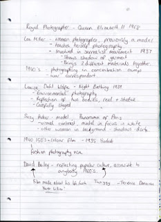
Fashion photography is around us wherever we go these days. Magazines, adverts, billboards, TV. It seems like quite a normal thing, photograph fashion to show to the public. Online stores do it to promote certain pieces of clothing, but photographing the clothing on a person you get a better idea of what it will look like once worn. There is another way, ghost mannequin - this is the disappearance of the human body and you could even class it as fashion in still life form. Just because it is fashion doesn't mean it cannot be classed as an artform.

Fashion photography has been around since 1856. The image to the right shows a Tuscan noblewoman, Virginia Oldoini, Countess of Castiglione, photographed by Adolphe Braun. He published a book which contained 288 photographs of her so in affect, Virginia Oldoini became one of the first fashion models. 

Fashion magazines had been about long before photography, however only illustrations were used as the technology had not bee developed. It wasn't until the 1900's when improvements were made to the halftone printing process, this meant that photographs could now be reproduced in magazines. During the 1920's and 30's the leaders in fashion photography were Vogue and Harpers Bazaar (both fashion magazines).

As the years have gone by problems have arisen with fashion photography. First launched in 2003, digital manipulation started to appear. This allowed people to go in and re-touch photographs, bodies and skin can be made 'perfect'. They can be made how you want them to look and how you want the world to see it. Back in the 90's there was a trend to show the real people, the grittiness, however once this came about people returned to wanting the style and sophistication of Hollywood glamour of the 40's and 50's. This has become a major issue within society and it basically depicts how you should look. It shouldn't be about photography slim people in haute couture, it should be people of any shape or size, it should be accessible to everyone. Fashion photography is seen everywhere and no-one should feel outcast by it. People should be able to relate and to feel comfortable with how they are and not have really slim models being the face of fashion.

In our modern day, it is not just restricted to magazines anymore, the internet is home to fashion blogs, people are able to not only show what they are wearing but to express their opinions. The internet is the place where it can be distributed worldwide. As magazines become more expensive people may turn more and more to blogs as they are a free source. Fashion photography will always be around, just the tables might be turned. Everyone can do it themselves now so it is already more accessible.


I found an interesting article where the architect, Jason Spiliotakos had created 3D backdrops for a new catalogue of a new fashion designer. This is quite different take and it shows how technology is combining within fashion. By doing this it might reduce the cost of flying the model, photographer and any extra people out onto location, however it depends on how long it would take to model and texture the backgrounds. The merging of different types of media is becoming more frequent now a days and sometimes these experimentations work and could open up new possibilities. It's definitely something to watch in the future as this work could lead to more job opportunities within the industry.

Tuesday, February 28, 2012

Tree house

Another option I think I might explore is a tree house with connecting bridges to other 'mushroom trees'. This is quite similar to Star Wars, the Ewok's village was up in the trees. If I created something like this, it may have a better back story to it as well. The game level itself would consist of you being able to walk around a small part of this village. When looking for different ideas of tree houses, I remembered that in Tarzan they had built their own home up in the trees themselves. This was mainly all in one tree, however there were different sections and a bridge in order to get down from the tree itself. What's quite interesting about this is that Disneyland actually recreated this tree house in their theme parks. I remember going there and it gives you a real insist to what it would have been like and contained a lot of details within it.

If I created an inside I would have to ensure it was aesthetically pleasing and just generally interesting, keeping in theme with the surrounding area and the actual backstory. For this module we have been given a poly count of around 100,000 so I will have to bear this in mind, trying not to create something that is overcomplicated and that involves a lot of polys.


These 2 images are just quick ideas I drew up of my mushroom forest. To the right I have a cluster forming, the mushrooms at different stages of their lives. The blues and greens I have used give off a completely different feel to the other image. It feels more alien and eerie, probably something that would seem less approachable. The image below I wanted to try other colours and also show an idea of a community living up within the trees. I will most likely expand on this idea further adding in more details and actual housing places.

I really need to come to a decision on who my target audience will be as this will determine what sort of colours I shall be using, I have a rough idea for the backstory I just need to pin it down now.

Saturday, February 25, 2012

Creative Industries

When looking at my specific sector, in the UK around 723,000 people are employed within the games, software development and electronic publishing industry (the highest of the 6 sectors within the creative industries). Because of that high number, this then translates to around 75,000 businesses that have been set up within that area.


Even though there seems an abundance of jobs within the games industry, when you look at the animation industry in the UK, it's not doing too well. Take Aardman for example, they had recently considered the possibility of moving its stop-motion division abroad in order to access more money and make shows that are more affordable to produce. Their CG department even have a co-production treaty with Canada, however this means that if a series is produced then Canada has access to the full range of support and subsidies as if it was their own production.

There has been a lot of incentive for people to move abroad to find work within the animation industry, and down at DeMontfort University in Leicester they have set up a petition to try and get the animation and games industry tax breaks an incentives. The petition is HERE.

I myself would love to work abroad in the future, I want to be able to explore different places and how different countries work. At the moment, people are choosing to move abroad because of the lack of jobs whether or not people will stay if given incentives is up to them. For some it's more about the lifestyle than the actual job itself so it really depends. In animation, it seems like all the major companies are abroad, America, Canada - they are the 2 major places. For someone like me who wants to work for a major motion picture company moving abroad would seem like the best option. However, before I can do this it would be best to get a good portfolio built up in the UK as it's easier to move about in the one country rather than across the world.

I personally think that if more renowned companies had been set up in the UK, more people might have been inclined to stay and try and get a job there. It's a choice between where you want to work and where there is actual jobs.

Mushroom Forest

As I was looking at overgrown plants and forests I began to think about the trees themselves. I didn't want them to be normal like the ones we always see, I wanted them to be something different. I started to look at different types of mushrooms and they are like miniature trees, so why not have them tree sized? maybe even bigger. The idea of a mushroom forest has been done before, however I don't want them to be the basic shape that seems to occur everywhere. By looking in depth into the types of mushroom and their attributes I will be able to find a suitable one to my liking. I quickly drew out some different species of mushrooms and already there are a few intricate and unusual shapes.

Amanita Jacksonii - this is quite the average mushroom shape, but what drew me to this however was the way it emerges. It's almost as if it is breaking out of it's shell like a baby bird would do. I like the idea of having these within my environment to show the different stages of the mushroom growth. To me it looks quite alien anyway and would very well suit an alien planet.


Like I said, I was also looking at the specific attributes to mushrooms and I came across one that was nicknamed 'Destorying Angel'. This mushroom as the name suggests is quite serious, it has toxic attributes and if ingested the result is severe illness and sometimes even death. We may only be building an environment for our game level, however there still needs to be a back story that goes alongside it. A possible idea could be that the ship crash landed on this planet due to some mechanical fault on the ship, the planet itself seemed quite deserted and to try and survive the pilot ate some smaller mushrooms (maybe even the fruit the mushroom trees give off), however little did he realise they were poisonous.


Obviously the more complex design of the mushroom looks more visually appealing and interesting, however I think it would be too hard to texture when it comes to it. I will have to bear this in mind when it comes to designing the final mushroom tree; I want something that I will be able to achieve yet will appeal to the audience.

Idea and Concept Development

When trying to come up with a new idea for games, the best way to start is to try and find some inspiration. Trying to create something that is purely from your imagination may be hard so a lot of the time it is best to gain real life sources. Playing countless games will not help as you are more likely to pick up on the same idea or story. It is far better to seek inspiration from a range of sources, literature, art, history. Pikmin was derived from the idea of a microcosm - a world in miniature. Shigeru Miyamoto had this idea whilst gardening, this shows that whatever you may be doing it can easily influence ideas and designs.

Obviously the best way to record any ideas is within a sketchbook, but it doesn't have to be just drawings. Any images that may be useful will help in designing certain aspects of your game. Whether or not you may think they are useful or relevant at the time it is best to keep a record of that idea or image. It may become useful at a later stage. Keeping everything in one place, one book will make sure you don't loose anything, keeps everything safe and organised. You will then be able to refer back to certain parts anytime you wish. A sketchbook can have drawings that are really rough or really refined, it doesn't really matter, rough ideas can be a way of experimenting and can be developed further over time.

Another way to gather information is by creating moodboards. Moodboards allow you to throw a load of images down onto a page. Images that are similar to one another, have a similar theme. They can show the type of atmosphere you want to portray in you game, the theme you want to have running through it or influences for a certain aspect. It's a good way to put images all in one place and use it as reference for when you begin drawing out ideas.

There are so many games out there, at some point you are bound to discard your idea because "it's been done before", however this may not be the case. Sure it might have already been done, yet you may be able to come up with a different response to familiar situations. Take Call of Duty 2, the designers of Activision changed the way the player would heal. Previously it was moving over a green first-aid box, however they realised this wasn't very realistic. Their solution was that when the player was injured, the edges of the screen would flash red, the player's vision would become blurred, movement would slow down and the ability to aim would decrease. Only without getting wounded again would you restore your health. By doing this the game itself became more tactical as they would have to use the available cover to stay alive if wounded; rather than rushing out to find that first-aid pack.

All these techniques will really help in aiding the idea and concept development of a game, however you can also apply this to anything you create like film or animation. These are the foundations and starting point for any designer.

A History of Advertising

This lecture just touched upon one history of advertising, there are many different ones out there but this one is about how the soap adverts came about and how much of an impact they had on society.

in 1851 Lever was born, this was also the year for The Great Exhibition. The Great Exhibition promoted colour printing and began to generate it more. The Lever Brothers, James Darcy and William Hesketh Lever, entered the soap business in 1885

Before the 1860's nothing came in any sort of packaging, but this was soon changed and pre-packaging was introduced, starting with cereals. Sunlight soap was the first to begin advertising extensively using this method and it was therefore lifted into a class by itself. In 1880, colour printing came about and this resulted in pictoral ads being printed in magazines, Sunlight soap then took advantage of this colour printing in 1890. Contemporary paintings started being reproduced and so Sunlight soap took these and reproduced them as their own, adding their own spin on the paintings. The imagery provided entertainment and it was now a product that seemed far more interesting. By adding a simple endline, Lever managed to change the meaning of the images to his own advantage.


When you look at the advertising for films, they all come with trailers, normally only lasting a couple minutes at the most. It's interesting to see how they can get the main bits of information, condense it down and try and get you interested to go see that film. Sometimes you have an amazing trailer that makes the film seem above and beyond itself, yet I've had personal experience where I have gone to see such a film and it hasn't lived up to its expectations. The trailers themselves need to get you interested without spoiling the film and showing all the good parts within that couple of minutes, there needs to be a balance. Another way to advertise films are through teasers, shorter than trailers, they give you a snipet of what is to come. These come before trailers and are a way of trying to get interest into the film before the main trailer comes out. A recent teaser that has really captured a lot of attention is Brave, Pixar's new film.

What it does well is the fact it leaves a lot of questions unanswered, yet it gives you some information for you to want to know more. It's very cinematic and visually appealing and the voiceover really drives the short. It gives it a foundation where it sets the tone and atmosphere of the scene and possibly the whole film.

Friday, February 24, 2012

Motivation


How Bad Do You Want It from Greyskale Multimedia LLC on Vimeo.

This post is more about the motivational side of things rather than the actual piece of media. Everything that is said in this video puts things into perspective. It shows how much you need to work at something if you want to be successful. It's not just aimed at NFL, you can interpret it into any field of work. Throughout the whole video all I could think about was how much I want to be an animator, how much I want to succeed in that field. I want to become the best that I can be and this has really got me pumped up. To me it's a motivational push. Loud and clear, you have to work for what you love. If you want to succeed you have to do everything you can, and more. Just doing the average amount is not enough. I am going to push myself from now on, not just in the animation field, but in all the areas of work within my degree. I need to step outside my comfort zone. I need to get back into drawing, observe movements more, take a sketchbook everywhere and just draw.

There is so much power behind this video. It puts into perspective how hard one man works for what he wants. If he didn't he might not be where he is today.

You have to breath it...

Star Wars

The most obvious thing to look at when wanting to explore the idea of alien planets, for me would probably be Star Wars. The moodboard below shows some images of a few different planets, some from the live action trilogy and some from the current animated series.


Both the live action and animated series draw inspiration from organic life and how weather would affect and change certain environments. Some of the live action environments are obviously more life-like and realistic to fit in with the human actors, yet the others even though we know they're not actually real, they are still believable and the characters do not look out of place. There needs to be a balance between story, environment and characters, they all have to work with one another. In my case it will be making sure the environment fits the story and the lighting and textures marry up to produce a believable game level.

Star Wars: The Clone Wars is the animated series which takes place between Episode II: Attack of the Clones and Episode III: Revenge of the Sith. It expands on The Clone Wars themselves and carries off where Episode II left off. As it is an extension from the live action films, the characters and the environments need to show similarities or else the continuity will be off. It's not been done before so there is the lee-way of creating new stories, and as it is animation, the sets and characters have become quite stylised. Kilian Plunkett, an artist that worked on The Clone Wars said that one of their planets, "Rodia took a long time. It was really hard to figure out what a Rodian city would look like, because all we really had to go on was Greedo (the unfortunate Rodian bounty hunter who met his end in A New Hope). It was hard to base an entire culture on one person." - The Art of Star Wars The Clone Wars

It's interesting to see how even if one character has been to a planet previously, they need to relate it to them in some form. A person who derives from a certain planet will have different qualities and characteristics from someone from elsewhere. This is something I will have to think about, even though I am not creating a character, the environment I build will give some suggestion to what may inhabit that planet. I will also have to come to a decision to whether I will want my level to be realistic or more towards the stylised area. I will have to start drawing up some ideas, trying out both styles to see what looks better and what I think I will be able to achieve. It's one thing to draw something down on paper, it's another thing to model and then texture it in the way you drawn it.

Unity: Box Modelling / Terrain

Box modelling is a quick and easy way to get an idea of the space within the game level you are trying to create. By using the pre-set shapes you can place them where you might want them to be, add in a first person controller and get a feel for the space as you would if you were playing the final game. By doing this it will also help when creating elevation plans as you will have specific dimensions for your objects within Unity.

We were all directed to create a shipyard and add in any extra components we wanted. From here we learnt how to add in shadows, fog - to add more atmosphere to the level and also a skybox. A skybox is wraps around the entire scene in Unity and as the name suggests, it replicates the sky. At the moment we have just used the pre-made textures, however you are able to create your own if you want to.

The next thing we learnt was using the terrain tool. This allows you to build up areas of terrain, in a way you're really painting areas. The longer you hold down on an area, the higher the peak will be. Along with the terrain tool, you are also able to paint either pre-set textures or your own textures onto them. You must take into consideration that whatever texture you choose it will have to tessellate/repeat so you will have to find the right balance between this and the size of the texture.

The good thing about Unity is that you can download pre-made assets for free. For this we downloaded terrain assets which included different types of trees and plants. When it comes to adding trees into the environment, you can either add them in by hand or paint them on within the terrain tool. If you add them in by hand they become geometry, this is good for realism, however it is not necessary to place them everywhere. It will end up slowing down the game. For trees that are further away it is better to paint them. Another way to make sure the game does not lag too much is to apply billboard. Billboard will calculate distances and after a certain point it will make objects 2D, yet when you walk close enough to them they will appear 3D again. The only problem with this however is that it can be quite noticeable so you need to find a medium ground where you think it look okay.

To make the scene more realistic you can add in a wind zone, this will create wind in your environment which in turn will make the trees sway. To make trees sway you need to increase the bend factor. I found it quite hard to make it look natural, however if I created trees in Maya I would be able to move the pivot point to the base of the tree, this would then make sure the trunk of the tree would be be more stable and therefore look more natural. Another issue I found was that if you have billboard on, it will also affect the trees being able to sway in the wind, only when you get close enough to the tree will it start to sway. This is far more noticeable than just a tree going from 2D to 3D, so I will have to take this into consideration within my environment and try and work around it.

UFO Idea

I was originally looking at the fairytale idea, however I began to think about the UFO option more and more and thought I should explore this one too, just so I can see if I can gain anything more from it. I have been watching a lot of Star Wars: The Clone Wars recently and I guess this was the push towards the UFO idea. The outcome is to be based around a crashed UFO site or Area 51 for example, however I think if I was to do this one, I would quite like to make it an alien planet where a spaceship has crash landed. To explore this further I have created a few moodboards on different films, their concept art and nature images. To me when I think of an alien planet I imagine overgrown plants and trees which would in turn make it somewhat creepy and mysterious, that's why the moodboards I have created have a lot of these ideas.


I grabbed several images from Disney movies as they hold some of the qualities I am looking for. With 'Atlantis: The Lost Empire' there are a lot of ruins, the whole place is really old but still quite elegant. It's not really an alien planet, however there is no reason why you could not interpret in that way, it is a separate world almost. The other 3 movies I took for the overgrown trees and plants, however with 'The Little Mermaid' I liked the look of the building underwater and the organic life. All these are quite fictional yet drawn inspiration from real life objects, the next thing I will look at will be 'Star Wars', both the live action and the animated series, comparing them against one another through their environments.


Above is a list of some films, animations and games I could look into for research, looking at each of their environments. I also did some rough drawings of possible different environments where the spaceship has crash landed. These are only to get across my ideas, nothing is set in stone yet, most likely things will change with development work.

Tuesday, February 21, 2012

Unity


Unity Web Player | Textures

Game Art Essentials: Ludic Scenography

A new module, a new brief. We have now begun our Game Art module and by the end of it we are to create a "Game Bible" and a 3D game environment prototype. With a choice of either 3 options, I think I will go for the Fairytale cottage, tower or fairytale setting. To start getting an idea of what is out there in terms of games I have created a couple of moodboards that show the type of fairytale style you would normally think of, games based on fairytales and any other games I come across which I think fit in.

Some of these games I have tried to get a hold of myself in order for me to get a better idea of what it is like on screen as you are playing it; as a screenshot may differ greatly and can give a different feel to when you are actually playing it.


I've taken screenshots from different games and I have found that in some scenes there is a similar colour palette that has been used. When you look at the 3 shots I have identified you can see that they each give off the same atmosphere and feel - calm, tranquil. Colours will definitely play a bit part in my game level so being able to identify the suitable colours is key. I will also have to make sure I use appropriate textures when it comes to it as well.


The above moodboard is from a MMO game called Dream Drops. It is currently not available to play online, however the closed-beta version will be launched at Hong Kong in May. Even though I am not able to play this game, the artwork and design of all the characters and buildings are for me, the typical fairytale style. As I have pointed out the main thing that stands out is the bright/bold colours, this is all well and good to give a happy elated feel to the game, however when you compare it to the moodboard above there is a bit more colour range. This is mainly due to the setting, but darker, cooler colours also would suggest enemies near by. Even though there will be no actual characters in my game level, I will have to take into consideration the actual fairytale story and whether or not it comes across more sinister or cheerful, this will then determine what colours I will use.

Wednesday, February 15, 2012

Essay Title / Research

As part of the Context of Practice 1 module, we have to write an essay on a chosen title that we are given. 'Do Trans-media narratives mean the death of traditional media? How is digital technology challenging traditional media?' is the title that I chose. I chose it because I knew I would be able to find enough sources to back up my essay, but also because I find trans-media quite interesting and this would be a good way of expanding my knowledge of the subject.

With the chosen essay title, I then produced a mind-map to see what areas I could expand on and this would then help me to find relevant sources. I have began to get books out from the library and pick out relevant ideas and quotes which I may find helpful and note them down in a Word Document. I have also looked at internet sources through Google Scholar and have found someone called Henry Jenkins, a media scholar. Through his blog I have found some really useful articles on trans-media so I will definitely have to pick out key ideas from there.

The essay itself is to be only 1,500 words so really that's not a lot of words so I will have to plan out what I'm going to say where and give a guideline to how many words I will allow myself for each section.

Morals / Values within Animation

A few weeks ago a guest speaker, Andy Peers came in to talk about value driven businesses and how we should really have our own values that we work by and for. I found it hard to try and come up with my own values right there and then and it wasn't until I looked into it further that a lot of animation companies are putting environmental issues within their work. Wall-E for example shows what the world could become in the future if we just let the rubbish build up and how much of an affect giant corporations have on our world, and ourselves. Happy Feet, looks at how we are using up the natural resources which are then in turn have an affect on animals and their habitats. Dr Suess' The Lorax (due for release next month in America) also includes environmental issues of deforestation in the film. Mike Bastoli of Big Screen Animation posted this BLOG where he found bottles of detergent that were 'The Lorax approved'. There's becoming more of an actual link between movies and the real world and how certain subjects within movies can actually change the way things are done in the real world.


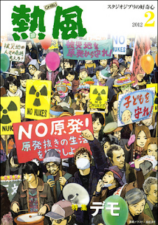
Studio Ghibli have always tried to integrate this into their movies such as Princess Mononoke, Pom Poko and My Neighbour Totoro. Pom Poko in particular showed how urban areas were developing so rapidly they were destroying animal habitats. Because so many of Miyazaki's films are so successful and how people react to them, in Japan they have formed a fund which is trying to raise money to protect the natural surroundings. There is even a forest called 'The Totoro Forest' which is now protected because of the film Totoro had such a huge impact on people (spoken about HERE by John Lasseter). It's not just movies however that are bringing environmental issues to our attention. Every month Studio Ghibli bring out their own newsletter and this months issue, the front cover illustrates a group of people in the middle of an anti-nuclear protest. It brings the issue out to a wider audience and with such a well known name backing the idea, it is sure to be more noticed and taken account for.

As you can see it seems to be really important to have value driven work. If you have no values then what does your work mean? Everything needs a meaning behind it. At this stage for me I don't think it's massively necessary, but in the next year or two I should definitely be able to pin point on what I want to focus on with my work. Especially when it comes to my final project in the third year, I think I should really have a message to put across with my work.

Sunday, February 12, 2012

The Illusionist


I had heard that the animation 'The Illusionist', was meant to be quite good, and with it being a silent animation I was quite intrigued to see what it was like. Silent movies are really a thing of the past now, there is no need for them you could say as we have sound, sound part of our senses so we must use it. However with a silent movie, and 'The Illusionist' in particular, it lets you concentrate on surrounding things you might not notice - the design, colours, drawing style. It's a breath of fresh air from all the action movies that you see now a days. It's the simplicity of it that makes it.

You have to pay attention to get into film but with this you are therefore more involved, more in-tune with the emotions of the characters. You see each character develop through their expressions and movements. This is crucial as without sound, how else can you know? There are only a few words spoken throughout the film, the rest is helped along by music. Music always plays a bit part in any film, game or animation for that fact, yet it becomes more noticeable when there are no spoken words. Music is another way of telling the viewer how they should feel, what emotions should be evoked. When you watch this animation, you know the music is there, yet it blends in with the style and the whole theme. It's not something separate but more of an extension of the film itself.

I really liked the style of this piece, going back to the roots of traditional animation, where it all began. To me it is an art form and you don't see enough of it these days. If this was a CGI animation, it may not have worked as well. It might loose the delicate feel and even though CGI can make it more realistic I don't think it would have suited. It's like turning a Disney classic in CGI, you just can't imagine it. If you like animation then I would thoroughly suggest this. It opens your eyes to something different and shows that it can be accomplished. Digital technology is great, however sometimes going back to where things started can be even better.

Thursday, February 9, 2012

Final Animation - Little and Large

So here it is, my first CGI animation. It's taken a good couple of months to get it all together from modelling to the final render and I have come across many problems on the way, but from this I hopefully should learn from this and not do it again in the future.

For saying it's my first animation that I have really ever done, I am happy with how it has turned out. Obviously being the one who has created it, it will never be perfect in my eyes and I will always be able to pick out faults and want to improve on it over and over again. I do know that there are a few issues that I may sort out in the near future. The lighting I think I definitely need to improve on and experiment a bit more with shadows and colours. In parts of the animation I do know that there could have done with some extra light here and there and I will probably go back and put these in after the deadline.

I concentrated far more on the animation side as that is what I really want to get into, but I realise that I do need to know all the basics and have an understanding of modelling, texturing, lighting etc. Animation wise, I am quite happy with what I produced, in my mind though I did want to create all these elaborate movements however it's just not possible at this stage, once I know how to rig then that will be the time to expand more with the animation.

I've taken a lot from this module, learning brand new skills and software and I think I picked it up pretty fast, even though I did make a fair few mistakes (especially when it came to rendering). I now know that when it comes to rendering I have to be REALLY organised with knowing what I've rendered and double checking the scene before I click render. Several times I've rendered a scene and forgot to turn on certain components so these were invisible which is not what I wanted. Luckily I started rendering early enough so I've had the leeway to make silly mistakes like these.

It's been a really good module and I'm definitely looking forward to when I can animate again and to also improve my modelling skills along with the other areas.

Background / Sound - Little and Large

I decided to create a background for my animation, just a simple sky to fit in with the rest of the scenery. I mentioned before I might try adding a few clouds in, instead I tried creating a blue gradient for the sky and ended up lightening different areas of it. The lightening ended up mimicking clouds quite well and I thought it would fit in nicely with my scene.


When it came to dropping the background in, I re-sized and also colour corrected it a bit as I found that it was a bit too light. I bumped up the contrast and lowered the brightness until I managed to get it working well with the surrounding environment. Even though I did this, I found that it was easier to colour correct it further in Final Cut Pro. I was able to lighten the blacks out so they weren't too dark. Within Final Cut, I also added my sound in which included a soundtrack and different sound effects. I struggled with this a fair bit as the soundtrack I had wasn't long enough for my whole animation and I had to cut it up in certain places for it to fit. Sarah ended up helping me out with this in the end we got it sounding much better than I originally had it. By adjusting the levels in certain places and overlapping sounds, the cuts in the music aren't too noticeable and I'm happy with how it is.

Sunday, February 5, 2012

Monster and Dumpling


Monster and Dumpling from JiHwan Jung on Vimeo.

Awhile ago I came across an animation "Out of Sight" and when I found this animation, Monster and Dumpling I was intrigued to see how a similar subject was portrayed by different people. Both revolve around a blind character however the storyline for each differs quite dramatically. This one is really quite compassionate and make you feel for not only the blind character, but the monster as well. In order to be really engrossed into something there has to be some emotional connection between you and the character. You have to be able to empathize with them which in turn makes it more believable.

The animation isn't the best in which I have come across, but I find that it is the story that makes it. Also I like the consideration of the colours that have been used. It's not too realistic but it fits in with the style of the piece. I really like how the light changes through the animation as well, as it goes from day to evening, the sky itself gradually gets quite beautiful. It blends in with the rest of the scenery, and as the day progresses, more colours are introduced and merge with one another to mimic a real sunset. All in all it's the narrative which I enjoy the most from this animation.

Camera Test

This is a test to how my animation will look with the cameras in place. As it has to be a multi-camera shot, the camera has to cut to different perspectives. We can get away with using just the one camera and cutting at certain points, with this it is the easiest when wanting to render out and putting the animation together.

With cameras, it is just basically animating an object, so there isn't much problem with it. When going from one shot to another I had to remember to key select all the attributes again so there wouldn't be the action between shots where you would see the camera move. I did try this, however I found that I wasn't able to achieve what I wanted, the result ended up being quite jumpy and just didn't quite work. I think this was due to the fact that the animation was already put in place and I hadn't allowed for extra frames inbetween to add in camera shots. The train kept on moving so when I jump cut the next shot it was too fast and the position of the train had changed noticeably.

I have a variety of shots from close ups to long shots and the camera zooming out to show the surrounding area. There needs to be a range of shots otherwise it can become predictable and it might not give the same effect that you want to achieve. The footage below shows the basics in what I am trying to achieve. Only 6 seconds is rendered at the moment, so the rest I produced a playblast to show the whole animation.

Saturday, February 4, 2012

Shooby Shooby Do Yah!


Shooby Shooby Do Yah! from Czarek Kwaƛny on Vimeo.

I came across this animation on Vimeo and it really fits in well with what I'm creating at the moment. It takes a train and really animates it in certain ways to give it personality and life. It bobs up and down along to the music as it travels on its journey and when it slows down the whole train squashes together to show this action. In essence these are just principles of animation, but it's how you carry them out, they still have to be executed well and make sense for why you are doing them.

The colours that have been used throughout aren't anything extravagant and they have been kept quite simple yet vibrant. However when you look at it, you notice there are different tones to each colour, it's quite effective as it adds more depth not only to the train but the scenery around it. I really like how the train moves along, things grow with it which actually is along the lines of what this animation is about. It is about personal growth and how we gather experience, personality, ideas and make decisions. A more indepth look into it is HERE. My animation doesn't have a real in-depth meaning like this one, however in the future I would definitely want to create something of my own accord that I feel strongly about.

This animation has also given me better ideas for camera shots, even though I am mainly following my storyboard, I have added and altered a few of the original frames. Mainly because I thought some extra things needed to be added and at the time one shot didn't work as well as another. I have found that panning the camera to follow the train quite successful and I like the way it has turned out. In this animation it works really well too, there is a lot of it but I don't feel that it is too much or too overused as they have altered the position of the camera slightly for several shots. It is still following the train, just from a different angle.

Knick Knack


knick knack from aplady on Vimeo.

Another animation that worked with simple colours was Knick Knack by Pixar. Now this was creating in 1989 so that could be a reason for the basic colours, however saying that when you look at each of the characters, you can tell that they are made from plastic so surely the block colours would suit them more and portray plastic far better. 

The background however, consists of different colours just to make it more interesting and to possibly break up the space. I think I will have to experiment with putting some clouds in the background of my scene, however I have to remember that it is in a desert and it's meant to be really sunny. I have to be able to keep it within that theme and atmosphere or else it will deter away from the original idea.

When looking at the animation for each individual character, they have simple movements to coincide with their actual design and anatomy. Nothing too drastic otherwise it would take away the believability of it all. I had thought about making my cacti in my animation move up and down to the music as the train passes it, when looking at Knick Knack they have similar movements so I could use this as reference. Due to time constraints however I will have to see whether or not I get round to doing this, if not before the deadline, I will definitely return to it to add in the extra movements to see what impact it could have. Obviously it would add more characterization, however it may not necessarily work as it may be too much, possibly distracting? but I guess I will only know if I try.

Rango - beginning scene

When I rendered out a test for my animation, I placed a plain blue background for the sky. I said I may go back and develop on this, however first I thought I would look at other times where the background has been pretty simple and has worked with the style of the animation.

Take Rango for example, the beginning scenes is of him in his tank, it isn't quite noticeable at first until you see the joints of the background, yet saying this, it still works. There is a slight gradient to the sky and a few clouds added to try and give a sense of realism to it, even though at the time you think it's probably fake anyway. I think it works though because it works with the detailing and texturing of Rango himself, so it doesn't look too out of place.

It's quite interesting to see the contrast between this beginning scene with it being so basic and the rest of the film. The textures for every other character is pretty astounding and so complex. For Rango himself, they had 120 different effects maps and 20 colour maps to make up all of his scales. I would want to try and see what I could do with textures (obviously not to this standard), to see what I would be able to create on Photoshop to then place it back onto my character. However due to the style of my animation it wouldn't fit in very well. As the style of my animation is all based around Brio - block plastic colours, I think just a plain background could work. I could experiment with putting clouds in the background and possibly have them moving across the screen at a slow place just to give it some movement.


Wednesday, February 1, 2012

Rendering

So I have began to light my scenes and get preview renders of what it will look like when it is fully rendered. The images below are just some screenshots I took from the render preview. The background is black at the minute, however as I want to drop a sky image in the background this will be put in place after the image sequence is rendered out. For these two shots I think the lighting is alright, obviously I'm not too sure how to light a whole scene and a moving object so it's just trial and error at the minute. I may look into other examples to see how people have gone about doing this.


I managed to get it rendered at here is what I got, only 6 seconds at the minute but I'm happy with what I have so far. Just to get an idea for the sound, I just dropped the soundtrack in with a train noise to see if they would fit in with the whole scenario. I really like how they all work together so I will just have to figure out how the rest of the sound will go. The background is literally just a blue colour to mimic the sky - but I will probably work on this some more before the final hand in date.