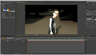
I had a lot of issues with the animation as I was going through this module and found myself getting very overwhelmed by the whole task. Looking back at it now I feel like I could have done a lot better on some shots. I made the mistake of not create playblasts of some shots so the animation ended up being quick 'jolty' without myself realising until it was rendered out, at that point it was too late to change anything. I think I'll go back to it at some point and change the shots I'm not happy with, but for hand in it'll have to do. I didn't think I would get it all rendered out and completed on time so I'm impressed with myself that I got this far.
There are some shots where the lighting could be improved upon, the images below show the ones I'm on about. In one shot the man's face catches the light too easily and it can be quite noticeable. I tried turning off the shadows and making his face not casts shadows but this didn't work. In another shot I think I forgot to put another light in, hence the dark forest in the background. Just little things that could easily be fixed if I had a bit more time. I took each image sequence into After Effects to export out and also tried to do any subtle colour correction here. I also created the title and credits in After Effects too.


No comments:
Post a Comment